Monday, August 15, 2011

Material Focus: Cardboard

A regular  model-making material, I hadn't thought about using corrugated cardboard in the the scale found in these two projects I found on Dezeen last week. I came across two interesting projects which utilized cardboard as a interior material, pushing the boundaries past the furniture uses I have seen in the past. 

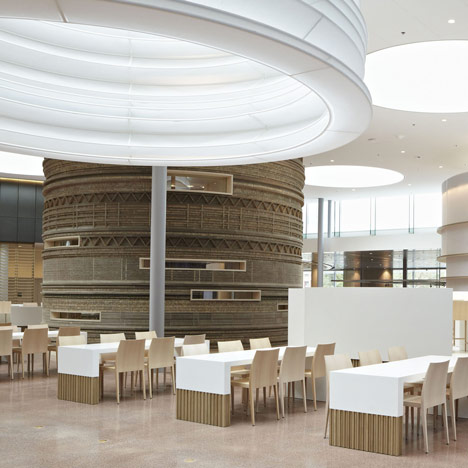
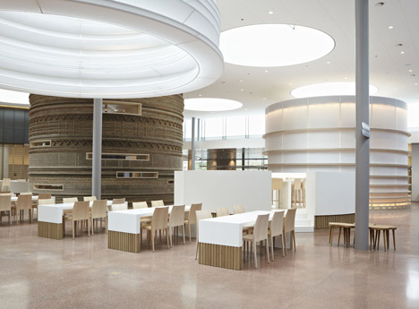
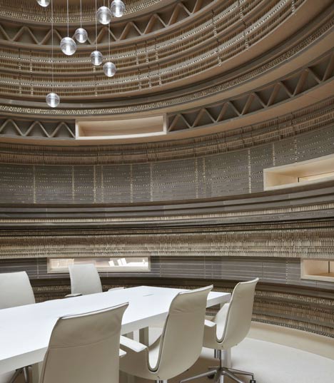
 Ameterdam design studio Sander Archiecten created meeting rooms within the main floor of the Rabobank headquarters in the Netherlands, and another dutch designer  Jeroen van Mechelen of Studio JVM created a vaulted ceiling detail in the guest room of a mountain Vila in Vals Switzerland. I liked how the interior of the bank uses the inherent texture of the cross section of the cardboard to create and a rhythmic texture up the sides of the cylindrical meeting room. It was also interesting to see the material, associated with all things square and rectangular, stacked and molded to a different form. The shape is echoed in the suspended paper cylinders that diffuse the light from the sky lights above. You do kind of wonder about the fire safety and what not of this paper filled interior, but whats the fun in that? 


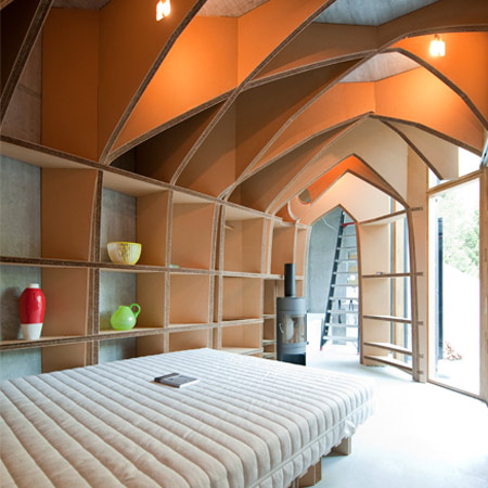
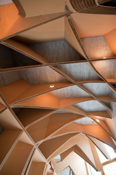
I also liked this Vila in Switzerland. Mainly I thought it was interesting to see a traditionally structural detail recreated in a clearly non-structural material. Generally (I think at least) the beauty of a detail such as this is born from the structural necessity of the form, the physics mandating a balanced and well proportioned design. The designer created  a theoretical structure to give this superficial addition structure and reason, by using the cardboard to materialize existing the conditions on the house such as the contour of the surrounding mountain and existing radials of the patio, the designer created a 3 dimensional matrix which served as a starting point for the ceiling detail. The way this detail reflect the conditions prevents it from looking completely contrived (even though by definition it is).  This detail is pulled to the floors to create a unique shelving solution.  


Images and projects via Dezeen.

Wednesday, August 3, 2011

Plumen Light Bulb

“It’s strange that the bulb, an object so synonymous with ideas, is almost entirely absent of imagination.” Plumen Website

I was so excited to see that the Plumen Light Bulb is now readily available locally. Plumen received Brit Insurance Design of the Year  for this product in February 2011. It became available in the USA, in limited quantities this spring, and is now available for purchase at Anthropoligie


Wednesday, July 6, 2011

Exterior Inspiration

I love how the tones of the surroundings are gradually pulled into the casual interior of this holiday home in Ardèche, in the South of France.  The tone of the surrounding red terracotta roofs are picked up in the painted surround of the outdoor pool.  'ETE' (been) stands against the pools wall, in a deeper saturated tone. Finally, the interior utlizies the same soft taupes and vibrant corals, reinforcing to, when in doubt, look to your surroundings to draw tonal and textural inspiration. It doesn't hurt when your surroundings are in the south of France. Images via Cote Maison.

The Village de Balazuc in Ardèche


Les Chaix, Holiday Home in Ardèche


Tuesday, June 21, 2011

Cognac Leather, Navy, and White.

Today I found this image of a living room from Cote Maison, and it reminded me of one of my favorite color combinations: cognac leather, with crisp white and a clean navy.  I am obsessively drawn to cognac leather in my personal accessories, it was nice to see it incorporated into a clean interior application.  I pulled together some local options, though I remain envious of those original lounge chairs. I will now embark on a unicorn hunt for a look-alike as Google's dubious french translation tells me they were custom made in Turkey for the designer.  I love how the grays tone everything down and prevent it from being overly-nautical. 
Via Cote Mason
From Top Left: Paladino Tufted Leather Chair From Sundance, Navy  Buche Rug From Madeline Weinrib,  Octupus Garden Wallpaper from Anthropologie, Blue and White Linen Blockprint From Madeline Weinrib, Patrizia Sofa From Anthropologie, Morrocan Rawhide Carpet from The Rug Company.

Monday, June 6, 2011

Fresh Fiddlehead Salad

This week there were some nice looking fiddleheads at the store and, given the short season, I scooped bunch up. I figure this would be a good first recipe to share since, oddly enough, I have been asked multiple times this week what to do with fiddleheads. For Non-New Englanders, fiddleheads are unfurled ferns. I think they are-for the most part-foraged. If you are supremely curious about fiddleheads, here is a direct link to the Wikipedia page (probably written by a real fiddlehead fanatic).   

Fiddleheads  have a hearty texture and an earthy flavor. To me this means they can take either a good rich sauce like a hollandaise, or other butter based sauce when served warm, or something really light and citrus based when served cold. I was looking to do the latter and this is where I landed.  Anyone who has seen me make salad dressing, should know these are not on-the-dot measurements. In fact, if anything merits the name beautiful catastrophe, it is probably my approach to cooking. 


Fiddlehead Salad with Endive, Shallots, and Cannelloni Beans

Approx. 1 1/2 pounds of fresh fiddleheads
Endive (1 large or 2 small) sliced to same thickness as fiddleheads
1 can Cannelloni beans rinsed and drained
2 large shallots minced
Approx. 3 tbs. Dijon Mustard
Juice of 2 1/2 large lemons
Zest of 1 lemon
Approx. 1 1/2  tbs. extra virgin olive oil.

Bring a pot of water to boil. Cook the fiddleheads in the boiling water until tender. Shock in ice water to stop cooking. Set aside. In a salad bowl mix shallots, mustard, lemon juice salt and pepper and mix well with a fork. Add olive oil and whisk rapidly to thicken up. There will be a lot of dressing, this is OK, the fiddleheads can handle it. Toss in the fiddleheads and endive and mix until well coated with dressing. Gently stir in the beans and lemon zest. Season as needed with additional salt, pepper and additional lemon juice to taste and enjoy! Really easy and good for a BBQ,with fish or alone for lunch.


Tuesday, May 31, 2011

Japanese Home-wares and Cherry Tomatoes

This weekend, a brief conversation with my uncle about Japan reminded me how many beautiful, paired down, Japanese household accessories and hardware I have recently stumbled. These pieces hold true to the minimal aesthetic associated with Japanese art and design, but do so with a beautiful softness that steps away from familiar straight lights of a Sohji Screen and other iconic Japanese items that many Americans are familiar with. 

Copper Scissors from Tajika Haruo Ironworks


Tableware from jurgenlehlshop

Tableware from Jurgenlehlshop


Everyday Scissors from Tajika Haruo ironworks

These pieces demonstrate a trueness to form, material, and function  on a human scale. The larger design community has been embracing these themes heavily lately, with a sober attitude towards the embellished. Japanese designers show that this is an inherent component of their culture rather than an immediate reaction to economic turmoil through a finessed approach to everyday household items. Regardless of the big picture, these are really lovely pieces that may provide a visual reprieve in your day-to-day activities. These pieces can be found at FutagamiMjolk (can ship products from Futagami), and Jurgen lehl, and images are from the sites as noted in the captions.  

Simple Towel Bar from Futagami


Brackets by Futagami
Pendant Lamps by Futagami
Bottle Openers by Futagami

 bowl and strainer by Sori Yanagi

I love the bowl and strainer set, in particular, probably because its produce related and in my mind they are already filled with farmers market cherry tomatoes. Yes, friends, I have found a way to weave my creepy love of fresh produce into this design blog. 


Thursday, April 28, 2011

Lounge Loving London

Back from London and back to reality, which oddly enough meant leaving 75  degrees and sunny for 45 and rainy here in Portland, but go figure. I was visiting a few close friends, living in distinctly different corners of the city in Fulham and Shoreditch, equally interesting and well suited to their respective inhabitants. My Shoreditch buddy has an eye for the types of place I like, so its great visiting her - regardless of the city - because I always know I will love wherever she takes me.

The Tea Building in Shoreditch

Shoreditch can't be called an up-and-coming neighborhood, because as far as trendy new neighborhoods go, it has long since arrived. The result of this establishment is the development multi-focused design oriented brands. Businesses that started off as a smaller notion in a location, once thought to be a gamble, have had the chance (and real-estate) to develop into brands that promote an entire lifestyle.  The end user gets to experience how these designers/ entrepreneurs would ideally spend a a larger chunk of life, rather than one aspect of it. Shoreditch's industrial backdrop, serves as an interesting background for these venues, and demands a certain level of creativity and eccentricities to stay afloat. 


The Bar: Lounge Lover
Les Trois Garcons is a design collective located in and around Redchruch Street.  In addition to high profile interior design services, they operate an antiques boutique, bar (Lounge Lover) restaurant and Château (admittedly, and obviously located  out of the city). It has sort of a Peter Pan feeling, in that it is extremely playful collection, with an unabashed mashing of periods, styles, and scale.  It is so clear the absolute joy the owners get from procuring these pieces and you can alwmost hear one person or another exclaiming that they need that 10 foot tall chinese vase.  The total abandomant of minimalism and need-based design was oddly refreshing, and felt wonderfully care-free given the recent tendency towards paired down design to match paired down spending. 

The Restaurant: Les Trois Garcons


 The Store: Maison Trois Garcon

The Chateau (yes, really) Chateau De La Goujeonnerie

On the same block, The Boundary contains a boutique hotel, cafe, market and roof-deck bar.   The Aubin & Willis Shoreditch location houses a theater and gallery alongside their  retail store   Each with its own distinct identity. There is no fear in appearing to be  larger than life, though each strives to make you feel as though you are at  home.  Whatever the motivation may be within each organization, the outcome for someone living in the areas is  not to shabby.  If you are not up for a "lifestyle experience", never fear, just like everywhere else in London, a pub as literally always around the corner! Photos are from the companies respective websites since I was silly and didn't bring along a camera... next time!

 
The Boundary


Images from the Aubin & Wills  Blog from the insanely British Tweed Run 2011.


Tuesday, April 12, 2011

Bookshelf Crush turned Architect Crush turned City Crush

Today at work I was looking or inspiration for  built in bookshelf for  client.  I was trying to figure out away to create a horizontal line connecting two areas visually without making the short ceilings seems even lower with a heavy handed horizontal  presence.  So I did my normal hap-hazard internet quest, and found the below image on Remodelista. I loved the small row of shelving for horizontal books or photographs by Aidlin Darling Design of San Francisco. I am always a sucker for things which are sub-divided in a Mondrian-esque manner.

My inspiration
It's (possible) Inspiration
Piet Mondrian 
Composition with Gray and Light Brown
1918; Oil on canvas, 80.2 x 49.9 cm; Museum of Fine Arts, Houston, Texas


I love San Francisco and regularly flirt with the notion of moving out there. Finding  firms like this Aidlin Darling doesn't hurt the wanderlust.  They have received attention for their work on  their LEED platinum  project Bar Agricole. They captured the LEED credit granted for sourcing products locally by commissioning local artists and designers to fabricate custom furniture, lighting and cabinetry using reclaimed or recycled materials, each with a unique story and role in the space. It also has an onsite garden that supplements the restaurants produce (local farmers provide the rest). They  beautifully integrated daylighting and natural ventilation with glass skylight sculptures (pictured below). LEED  is, after-all, a giant check list. It's always nice to see someone using that list as a creative challenge rather than a series of constraints. 

Glass Skylight Sculptures
Fused hot-formed borosilicate Glass Tubing
For Bar Agricole by Nicholas Weinstein Studio

Bar Agricole

There are also some great residential projects, showing off the clean lines and organic materials  frequented by Bay Area architects. This vineyard estate is no exception to the trend, but I do love it. 

Vineyard Estate

Below is an image from the project in the Mission District of the city, that housed the bookshelf that lead me here in the first place.  So there we have it, reason number 945 why I would love to live on the west cost.  Photos are from the Bar Agricole website, as well as the Aidlin Darling Design Website. 

Losa Loft


Friday, April 8, 2011

Entry Hall Tile


Filmore Clarke

I love these Moroccan-inspired tiles. They could be really great in an entry hall, mudroom etc. You will have minimal furniture and fabrics competing with the tile,  and most likely many doors and windows leaving little room for wall art.  Filmore Clarke makes their hand-painted ceramic tile in Los Angles. Popham Design produces thier tile in Morocco, and can be purchased in the States through Ann Sacks

Popham Tile, Made in Morrocco.


Popham Tile, Made in Morrocco.


Monday, April 4, 2011

Trim System by Dada


I  love the look and feel of a kitchen with open shelving. But it really only works as beautifully as seen in a magazine if you have a curatorial approach to the items in your kitchen. For those people who don't simply live off of Illy coffee and artisanal honey the thought of having all the goods exposed can be a little daunting. I like this system from the Italian kitchen systems designer Dada . This gives you that same aesthetic, with the option to hide things away. ie: if company is coming by and you don't have time to make sure all of your labels are facing forward, and your Tigger Mug is concealed behind your set from the MoMa gift store.

There are a lot of great details in this kitchen system, is is designed to the millimeter and it shows. One unique feature is the shallow shelving below the full depth cabinetry  allows you to access the commonly used cookware items (which often look great exposed) but still give you the tidier option of pulling down the translucent covers. I like that it will just hint at the geometry of whats behind.  It is also lit from the inside so it creates a really nice ambient light at night. 

You could get a similar effect with frosted glass cabinet doors, but I think the appeal of open shelving is the clean horizontal plane it creates, and the fact that items are in sight and at hand when you want them. To get a similar effect, with a smaller price tag , you could install a shallow storage area below the cabinetry, concealed by a translucent material like 3form, that would slide horizontally rather than down into the counter-top, or hinge up like a garage door and stick magnetically bottom side of the shelving and cabinetry above.    It could be really helpful in a small kitchen where counter top clutter makes the space feel even tighter, though for now my future fantasy kitchen will absolutely involve 13' high ceilings, plenty of light, and two cognac leather Arne Jacobson Chairs.